Client/ The Economist
Campaign idea/ There’s more to it
Channels/ DOOH/ YT/ Social/Digital/ Radio
Market/ US
Challenge/
Show the uninitiated that there is more to The Economist than its name suggests.
Campaign idea/ There’s more to it
Channels/ DOOH/ YT/ Social/Digital/ Radio
Market/ US
Challenge/
Show the uninitiated that there is more to The Economist than its name suggests.
Solution/ With head-turning headlines, we surfaced the editorial content that would shift perceptions - articles that make unexpected connections and revealed the world in a new light. In each instance, we wrapped up with ‘There’s more to it’ - inviting people to satisfy thier curiosity and read on.
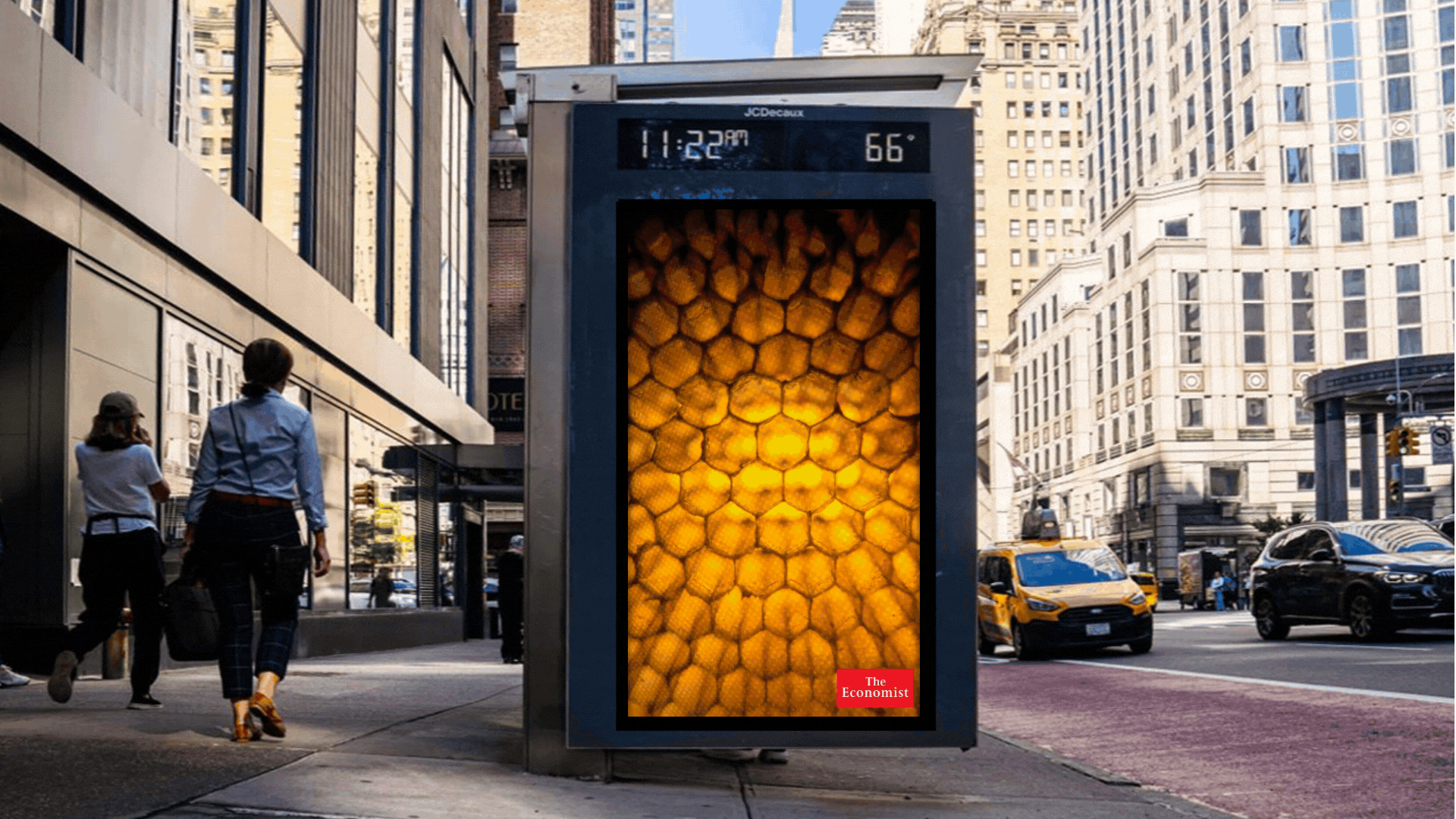
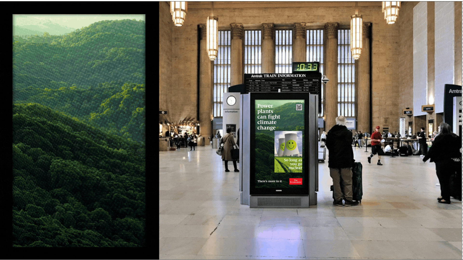
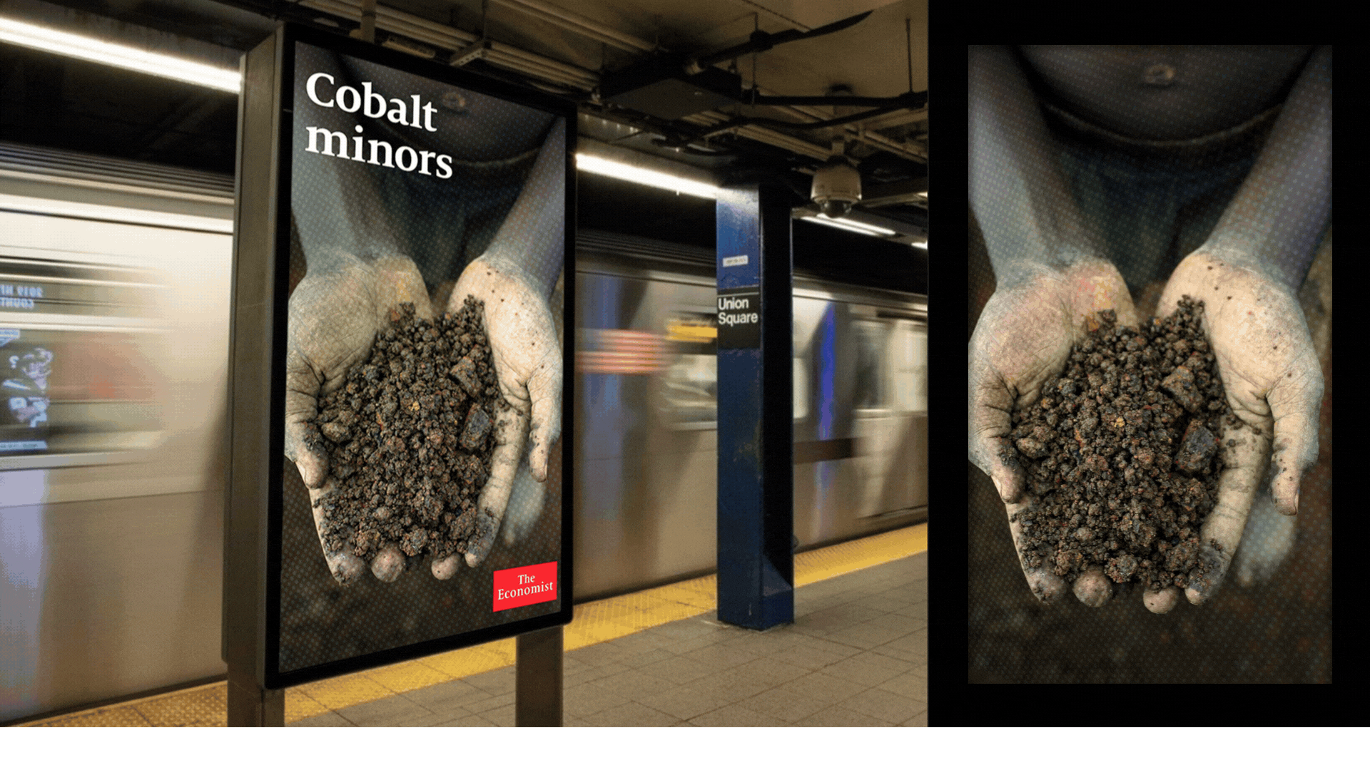
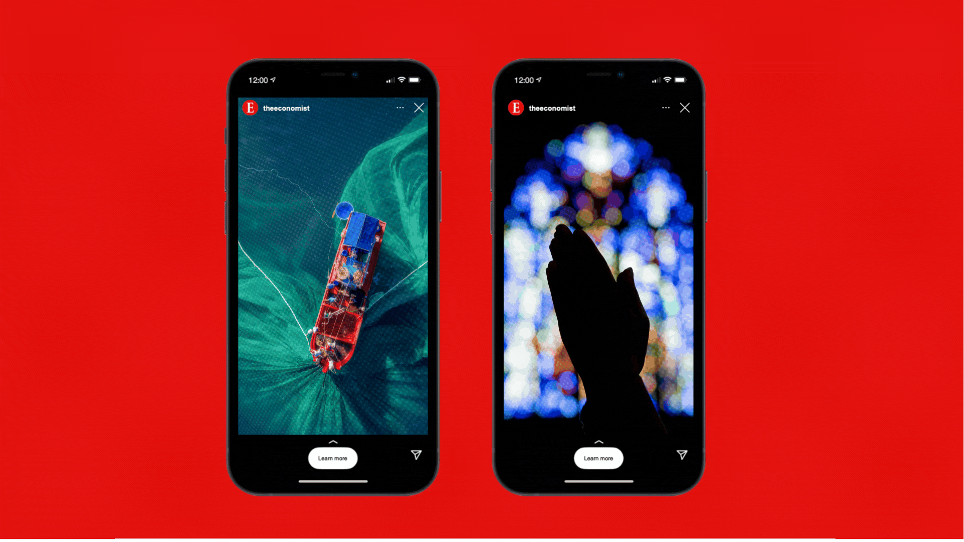
An editorial look and feel was developed using images to reflect each article and headline. A layered visual effect to represent depth and intrigue was created whilst working in harmony with the existing Economist iconic red and typeface.